

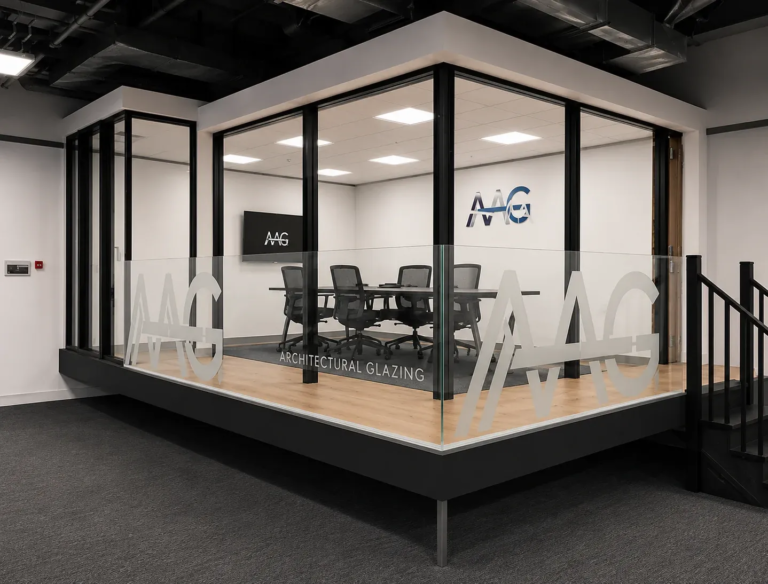
Every business with a physical presence has, in effect, a permanent advertisement running twenty-four hours a day on the street outside. Most business owners think of it simply as their sign, the thing above the door, on the window, or at the roadside. But the most commercially aware ones understand it differently. They see it as the single marketing asset that works hardest for the least ongoing investment, and they treat the quality of their printed Business Signs accordingly.
The Three Seconds That Define a First Impression
Research into how pedestrians and drivers process street-level information consistently shows the same thing, decisions about whether to engage with a business are made in seconds, not minutes. The window of attention available for your signage to communicate something meaningful is genuinely brief, which makes everything about that signage, the typography, the colour contrast, the material quality, the size relative to the setting, critically important.
A sign that is difficult to read, that uses colours without sufficient contrast, or that looks worn and faded does not simply fail to attract new customers. It actively communicates something negative about the business behind it, whether that was the intention or not.
What Professional Sign Printing Actually Changes
The quality of a printed sign influences how a business is perceived from the first glance. Professional sign production combines the right materials, accurate printing, and precise finishing to create signage that looks polished and performs reliably over time.
The Visible Difference That Quality Makes
There is a meaningful difference between a sign produced by a professional sign printing operation and one produced at a budget print service without proper colour management or substrate expertise. The differences are visible to the eye of every person who passes:
- Colour accuracy: brand colours that match across every format, not colours that shift between the logo on the website and the sign above the door
- Edge quality: clean, precise cuts rather than the slightly rough or uneven edges that cheaper production often leaves
- Material integrity: substrates that hold their appearance through rain, direct sunlight, and temperature variation rather than fading, warping, or peeling within months
- Print sharpness: text and graphics that remain crisp and readable at the intended viewing distance
Format Intelligence: Choosing the Right Sign for the Right Location
Not every sign format works equally well in every location, and choosing correctly is a decision that significantly affects how much impact the finished sign delivers.
| Location Type | Recommended Sign Format | Why It Works |
| Above shopfront entrance | Illuminated fascia or high-quality flat panel | Visible day and night, anchors the brand at eye-catching height |
| Window display | Frosted vinyl or full-colour window graphic | Maximises visible frontage without blocking light |
| Roadside or pavement | Correx, aluminium composite, or A-board | Catchable at vehicle and pedestrian speed |
| Interior (retail/hospitality) | Foamex, acrylic, or fabric display | Premium finish suits customer-facing environments |
| Outdoor long-term | Aluminium composite or dibond | Durability appropriate to long-term outdoor exposure |
A sign printing partner who understands location dynamics will guide this conversation rather than simply producing whatever format the client suggests.
Typography: The Make-or-Break Decision in Signage
Effective signage depends on clear communication, and typography plays a central role in achieving it. Choosing the right fonts improves readability, strengthens brand recognition, and ensures key messages remain visible from the intended viewing distance.
Why Font Choice Is a Functional Decision, Not Just an Aesthetic One
Typography in signage is one of the most consequential decisions in the entire design process, and it is also one of the most frequently underestimated. The typeface that looks refined and on-brand in a brand guidelines document may become entirely unreadable at three metres on a shopfront, particularly in variable lighting or when viewed at an angle from a passing vehicle.
The principles that make typography work in signage are not complicated, but they require deliberate application:
- Weight: fonts with sufficient stroke weight remain readable at distance; thin or light typefaces disappear
- Letter spacing: generous tracking between characters improves readability significantly at outdoor viewing distances
- Contrast: the colour relationship between type and background must hold up in every lighting condition the sign will experience
- Scale: the practical test of whether text is large enough is whether it can be read in the available viewing time, not whether it fits the design
The Brand Consistency Challenge Across Multiple Formats
For businesses with multiple locations, multiple sign types, or a combination of indoor and outdoor signage, achieving genuine brand consistency across every format is a technical challenge that only professional sign printing operations manage well.
The same brand red looks very different printed on vinyl, painted on metal, applied as a laminate to foamex, and screen-printed on a fabric banner. Achieving consistency requires colour management that accounts for each substrate and each print process, applied by a team with the expertise and equipment to execute it.
This is one of the clearest distinctions between professional printed business signs and budget alternatives, the ability to make your brand look like one coherent identity across every physical touchpoint.
Maintenance Considerations That Most Businesses Overlook
Signs are not set-and-forget investments. They are subject to weathering, UV degradation, accidental damage, and the gradual physical effects of temperature cycling. Businesses that plan for this, choosing materials appropriate to the exposure conditions, specifying UV-resistant inks and laminates, and establishing a review cycle, maintain a street presence that continues to work hard over years.
Businesses that do not plan for it often find themselves replacing signage far sooner than necessary, at a cost that could have been reduced significantly by making better material choices at the outset.
Conclusion
A strong street presence is not accidental. It is the result of deliberate, informed decisions about format, material, typography, and colour management, made by people who understand how signage actually performs in the real world rather than how it looks in a design presentation. Sign Company London brings exactly this level of expertise to every printed business signs project, helping businesses across the capital build the kind of street presence that works every hour of every day, regardless of whether anyone is consciously looking for it.
Author Bio: Nimesh Kerai
Nimesh Kerai serves as the Printing Head at the Sign Company in London. Utilising his technical aptitude and the trait of keeping up with the latest technological advancements, he has been able to deliver top-notch quality prints and signage to sou customers consistently. This has cemented the Sign Company as one of the most sought-after signage companies in London. He consistently shares his insights with the masses by means of useful and intriguing blogs.
